CSS3 Basis part 4 of 4
In this post we will have a look at layout and navigation options available in CSS3.
Layout
There are majorly two approaches for designing the layout of the page: fixed layout and fluid layout.
Fixed Layout – This type of layout is easier to implement as in this layout the size of the content does not changes with the size of the browser. So no matter what our page occupies the same size at any point of time irrespective of the resolution or size of the browser.
Fluid Layout – This type of layout requires more work as whenever the size of the browser changes then our page has to respond to changes by adjusting the page layout and size.
How to design the layout of our page
- Identify your content

- Add the content to the web page

- Arrange the content inside the boxes

- Use float to make the user interface fluid
Currently our page looks like the image shown above. Let us redesign our page into column based layout and to that we will move the About CSS3 section to a column in the right.
- One important thing to remember is that if want some content in a column then it should be defined before the main content.
So let us take the aside which has About CSS3 content and move it above the article itself. The next step is to assign a class .sidePanel to the aside.
Now we add another section just below the previous one.
Advanced concepts in CSS


Posted on 25th Sep 2013

by

Abhishek Shukla


In this section we will learn advanced concepts in CSS3 so that we can take it up a notch.


Since you have a good foundation of CSS3, now we will go ahead and look at the advanced concepts of CSS3. We will also get our hands dirty with some practical examples.
Currently our page looks something like below.
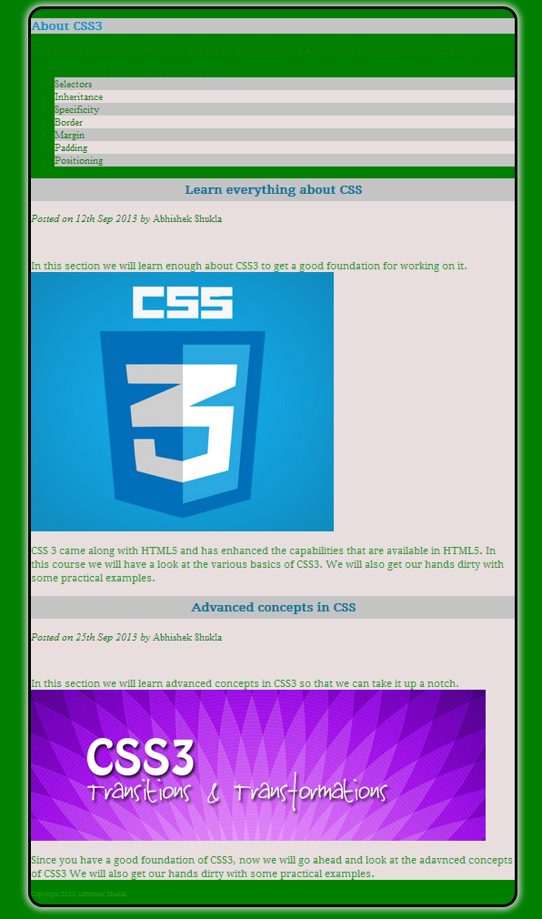 Layout
Now let us create a new class .sidePanel that we assigned to our aside.
.sidePanel

{

float: right;

width: 150px;

margin-top: 50px;

margin-right: 10px;

}
However our page still does not look like we would want it to. We have the main content and side panel running into each other and the main content getting distorted because of the side panel.
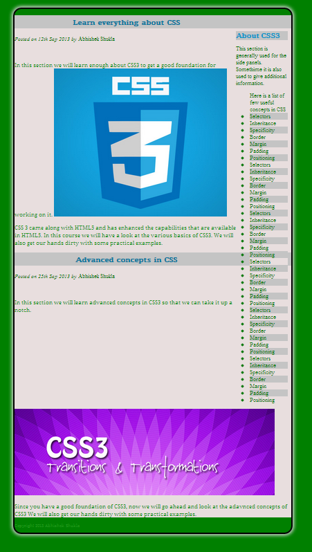 Layout
To work around with issue we will do 2 things:
- We will add a class .mainPanel which will have the right margin greater than the width of the right panel..mainPanel
{
margin-right: 175px;
}
- Reduce the height and width of the image so the that it fits nicely..image
{
width: 80%;
height: 80%;
}
So finally the code for our webpage looks something like below
Learn CSS3
p
{
color: #24981f;
font-family: 'Noto Serif', serif;
font-size: medium;
}
h1
{
color: #0f769d;
font-family: 'Noto Serif', serif;
font-size: larger;
text-align: center;
padding: 5px
}
h2
{
color: #1197c9;
font-family: 'Noto Serif', serif;
font-size: large;
}
footer p
{
font-size: x-small;
color: #000000
}
.article-title
{
background-color: #c4c4c4;
}
.meta-article
{
font-style: oblique;
}
.meta-author
{
font-style: normal;
}
#first-article
{
background-color: #e8dede
}
ul :nth-child(odd) {background-color: #c4c4c4}
ul :nth-child(even) {background-color:#e8dede}
.webPage {
font-size: 16px;
background-color: #000000;
width: 800px;
margin-top: 25px;
margin-left: auto;
margin-right: auto;
border: 5px solid black;
border-radius: 25px;
background-color: green;
box-shadow: 0 0 15px 5px lightGray
}
.sidePanel
{
float: right;
width: 150px;
margin-top: 50px;
margin-right: 10px;
}
.mainPanel

{

margin-right: 175px;

}
.image
{
width: 80%;
height: 80%;
margin: 5px;
float: right;
}
About CSS3
This section is generally used for the side panels. Somethime it is also used to give additional information.
Here is a list of few useful concepts in CSS
Selectors
Inheritance
Specificity
Border
Margin
Padding
Positioning
Selectors
Inheritance
Specificity
Border
Margin
Padding
Positioning
Selectors
Inheritance
Specificity
Border
Margin
Selectors
Inheritance
Specificity
Border
Margin
Padding
Positioning
Selectors
Inheritance
Specificity
Border
Margin
Padding
Positioning
Selectors
Inheritance
Learn everything about CSS
Posted on 12th Sep 2013
by
Abhishek Shukla
In this section we will learn enough about CSS3 to get a good foundation for working on it.
CSS 3 came along with HTML5 and has enhanced the capabilities that are available in HTML5.
In this course we will have a look at the various basics of CSS3.
We will also get our hands dirty with some practical examples.
Advanced concepts in CSS
Posted on 25th Sep 2013
by
Abhishek Shukla
In this section we will learn advanced concepts in CSS3 so that we can take it up a notch.
Since you have a good foundation of CSS3, now we will go ahead and look at the adavnced concepts of CSS3
We will also get our hands dirty with some practical examples.
Copyright 2013 Abhishek ShuklaAnd the page looks like
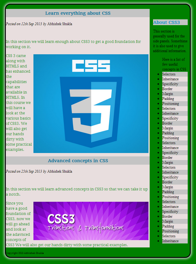 Layout
Navigation
In a website navigation is generally done by the use of links and these links do nothing but take to a different webpages.
To create a navigation bar we will start off with an ul with the list of links that we want to use in the navigation bar. So let us create a list of links just above the main div.
Home

CSS

HTML5

JavaScript
We have added 4 links and these will appear at the top of the page. So this how our page looks now. We see the background styled because of the ul styles that we have specified before.
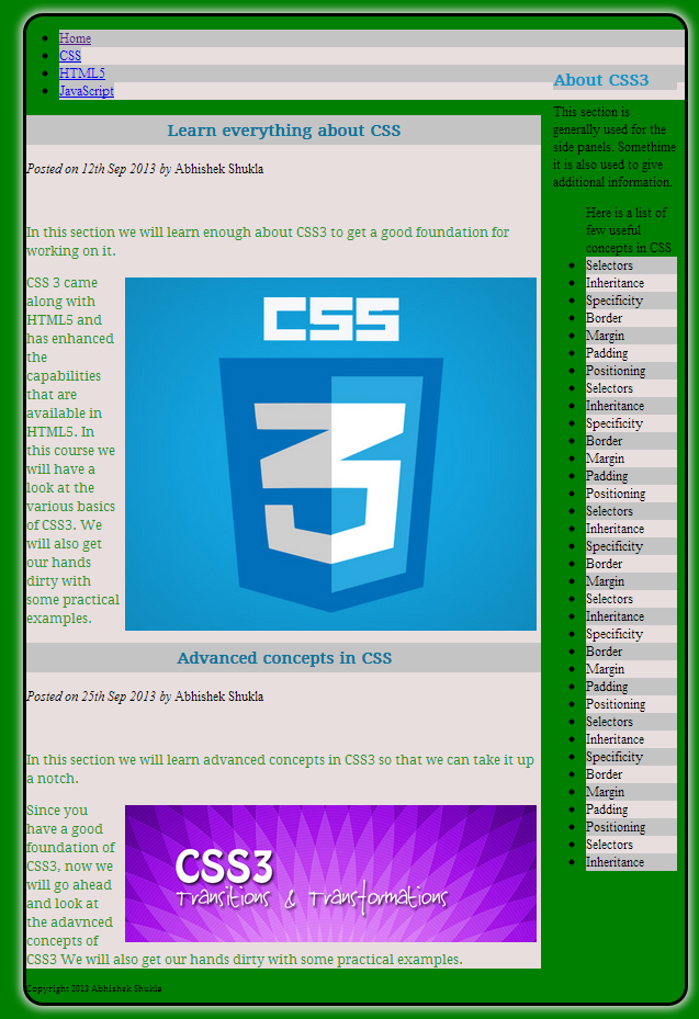 Navigation
Now we will remove the bullet style form the li. We will add a new style for ul.mainMenu and reset the list style to none and will make the bullets disappear.
ul.mainMenu

{

list-style-type: none;

}
Let us remove the padding and margins as well.
ul.mainMenu

{

position:relative;

list-style-type: none;

padding-left: 0px;

margin-left: 0;

border-bottom: 1px solid #000000;

text-align: center;

}
And now the looks much better
 Navigation
Now let us take the block level ul tag and make it into an inline tag so that there no new line between each entry. So now all the links will appear in one line.
.mainMenu li

{

background: green;

display: inline;

}
Navigation
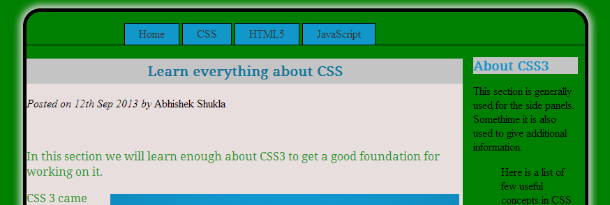
We can now style each li to look like buttons so let’s go ahead and style the li with color, border, etc.
.mainMenu a
{
background-color: #1197c9;

color: #393636;

display: inline-block;

border: 1px solid #000000;

border-bottom: none;

padding: 5px 20px 5px 20px;

text-decoration: none;

}
And now this is how our page looks like
 Navigation
The code for this post can be found here or @ mirror
Any questions, comments or feedback is most welcome.