Expression Blend 4 : Control Customization
Control Customization
The whole idea behind WPF architecture was that the presentation layer is completely separate from the functionality. This means a button may look like an image or a circle but still have all the functionality of a button.
Custom Controls
- Create a new project named CustomControls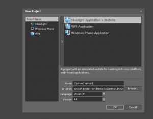
- Before we start customizing a control let’s talk about style and template as this will be required for control customization.


**Styles** – A style is a resource that contains a set of property setters. To see how this works lets create a rectangle on to the design surface. Right click on the rectangle and select Edit Style à Create Empty.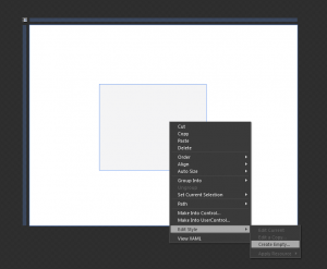
- Give the style a name and select its location and click on okay
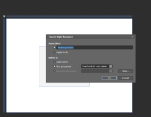
- The left breadcrumb shows the Layout Root. As we are working with a rectangle we see a rectangle here

- The next breadcrumb shows us that we are working with Style. This is represented by an icon that looks like a painter’s palette.

- The scope that we are working on has changed to RectangleStyle and the name of the style is RectangleStyle1.

- We see only one element as of now which is the style.

- All asset creation tools have greyed out as when we work in a style we are restricted to the property of that element which is a rectangle in this case.
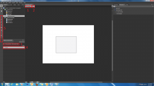
- Now let us set some the properties of the rectangle which we will be able to see in the style later on. The properties that are changed are highlighted as red.
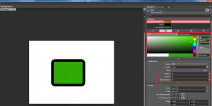
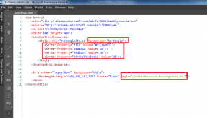
- Now let us switch to the XAML of the style and we could see a set of setters as a part of the style of the rectangle which contains the name of the property of the rectangle and its value. Also it has a target type which would specify as to which Element type to target to. You can also see how the rectangle refers the style.
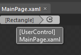
- Now just click on the Rectangle in the Breadcrum bar to go back to the Root Document.
- When we right click on the rectangle,we would see option to Edit the current style of the rectangle or edit a copy that style or create a completely new style or apply resource which can be any other style already created.
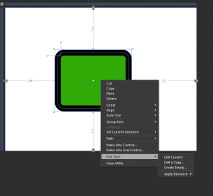
- Now just create a rectangle onto the design surface and you would see that the Fill is not set for the rectangle the way it is when create a rectangle by default the reason is that blend expects you apply a style to this rectangle as the last rectangle you were working with had a style. So just right click the rectangle and go to Apply resource and select RectangleStyle1.
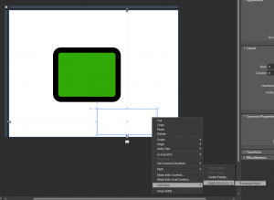
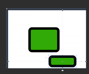
- Now close your document and open it again and create a rectangle and you would see that the rectangle Fill is set by Blend to default White. Even when you apply the style this white Fill is still there, this is because this fill is set on the rectangle level along with the style and hence overrides the style Fill whereas all the other properties are inherited from style.
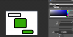
- Now just click on the property marker next to the Fill property of the rectangle and select reset and you would be able to the Green Fill of the rectangle again.
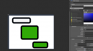
- **Templates**– The limitation of styles is that style can set properties on the element you are working with. This means that if you are working with a rectangle you can apply that style only on a rectangle. Whereas the template property is on the control which sets the entire Visual Tree. All of the visual states and entire stuff that makes the control.


Let’s create a button on the panel. When I right click it instead of the edit style option I have Edit template option in which I see option of Edit a copy which will create a copy of the existing default template of the Button and give us to edit and a Create Empty will create a new empty template for us to edit.
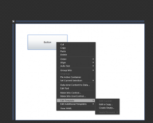
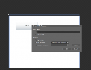
- Now when click on Edit a Copy you would see a dialog box like below asking to give a name to the **style**, its asking to create a style and not a template because you can only apply a style to a control and the template is a part of the style. You can also see the option of apply to all. This option will actually create the style with no name nad apply to all the button in its scope.
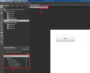
- We are working with the template within the style within the button. You can have a look at the xaml and see that the style has a target type set as button and the setter property template has visual states, border, grid, rectangle, etc which the complete visual tree of the button and will decide how the button looks and behaves.

- You can see the Button Visual Tree here.
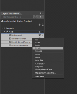
- Now just right and delete all the elements inside the grid so that we can create the visual of our button from scratch. And then press ctrl + 9 to zoom into the grid we are working on.
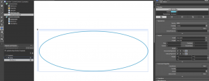
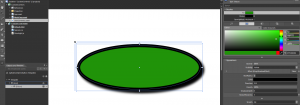
- Now add an ellipse and set the alignments to stretch and margins to 0
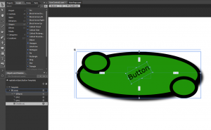
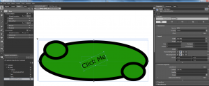
- Now Go to the assets library and add a couple of rigs to the corners of ellipse. Also now add a textblock on the ellipse and rotate it and make the text as button. Now run the application and you would be able to the button.
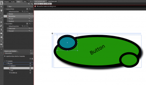
- Now go over to the states and we would see how the button looks at various states like mouse over and mouse pressed, which is the same as of now as we have not added any effects. Now let’s change what the button does on mouse over and Pressed. Just select MouseOver in the states and change the color of one of the rings and then select Pressed state and change the color of the other ring. Now run the application and see if the effects work at runtime as well.
- Now let’s add some transition speed. Now select Mouse Over and change the textblock foreground to white and ellipse fill to black and also change the Default Transition speed from 0s to 3s and when we run the application we will see that all the animation states transition very smoothly.
- Now let’s add a new transition. Click on the Arrow+ in mouse over and we could see the transitions we could use. Select the 1st option.
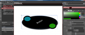
- We can also set the transition effects.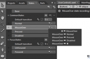
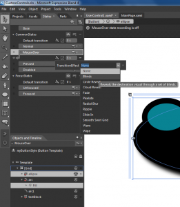
- Now you can add new button and apply this style we have created.
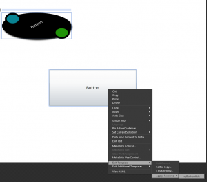
- Now if you set the background on the button it will not be applied to the button because it is taking its values from the template. Now we need to modify the templateSo that the value is picked up from the control. So go ahead and edit the current template and select the ellipse. Now go to the property marker of the fill and select Template Binding à Background

- When we change that the value will be coming from the parent and not the template as we have template binded the control to parent. Now if we go to the Mouse Over transition we will see that background color is not changed. So we need to decide as to do we want to template bind it to parent of Control Template.

- Let’s Template Bind the Text of the TextBlock to Button Content. So select the TextBlock in the template and goto Common Propertiesà Text and click on the PropertyMarker and select Content as button being the Content Control we need to bind to the Content of the Button. But this work fine only till our content of the button is text.
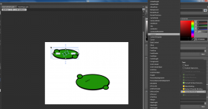
- So we have any other content then we should use content presenter for it. So add one to the template and align it to center and reset all the margins and rotate it the way you want.
Any Comments, feedback or suggestions are most welcome.