Learn WPF: Part 3 of 9: Layouts in Windows Presentation Foundation
Hey guys,
As you would all know that the building blocks of an application are controls but you need to know the layouts as well to know where and how you can place these controls? So we are going to talk about the layout panels in WPF, what are the common layout properties that are offered by WPF and we would also have a look on how to create a navigation application in WPF.
Before we go into what layout panels do WPF has to offer we need to have a look how the layout processing happens in WPF. Now it is obvious that WPF will redo the layout when the applications starts or when something changes on the layout. The layout occurs in two phases: measure and arrange.
In the measure phase WPF walks through the each element in the tree and finds out as how large each element would like to be by calling the method Measure() on each element and it also tries to provide the information as to how much space is likely to available. There are two types of layouts that gets formed: Constrained (when WPF is able to make a good guess of the space that might be available) and unconstrained (When WPF does not have a fair idea of the layout space available). Now elements are not supposed to ask about the space during the measure phase so they just return the preferred size. Also in the unconstrained phase where the size passed is infinity the elements are supposed to return the exact size they require. This sometimes also known as Size To Content.
In the arrange phase WPF calls the arrange method on each element as it now know how much space each element requires. WPF tries to accommodate each elements requirement and if the space provided is less than the controls asked then the controls will be scaled accordingly. But if the element is asking for impossible space then the elements will be cropped.
Declarative Layout
WPF wants us to specify what our requirements are and then in the background WPF does all the work to arrange the resources for it. The best part of it is that it is declarative and can be defined entirely in xaml which can be of course customized as well.
WPF layouts also have the special facilities like automatic resizing according to the space available for the layouts. It also supports dynamic changes that are made to the WPF applications like adaptations to data changes at runtime or locale changes at runtime.
Some of the common layout properties provided by all the layout controls in WPF as Margin, Padding, Horizontal Alignment, Vertical Alignment, Min/Max Width, Min/Max Height, Width, Height. These provide the consistency in the layouts in WPF.
Margin
The margin property helps us determine how much place is there around the space around the edges. Means if you do not want the control to take lesser space then it has been allocated to it so that it does just stick its border along with other controls you could use the margin.
We could specify the Margin as a single value and control will have uniform outer space around it. The unit for the margin is device independent pixels.
 Margin in WPF
This means that the unit is 1/96th of an inch. So if the margin is specified as 96 pixels then the control will have a space of 1inch around it in theory but in actual this would happen if windows know the resolution of its output device, which is not the case in most cases as most of the windows pc end up in default configuration. If windows does not know the resolution then it will guesses it 96 for 1 inch across. But if windows is using large font sizes then the windows will guess that 120 pixels for 1 inch of the space. So now the WPF unit will be a little larger than the normal pixel. So this is confusing.
We could also specify the Left and Top margin or you could specify the left, top, right and bottom margin specifically.
 Margin in WPF
Padding
The Padding property is similar to margin. As margin specifies the pace outside the control padding specifies the space between the border and content of the control. Padding is not available for all elements as it makes sense for controls that have content. Just like margin padding can be specified as a single number, left and top or explicitly for each left, top, right and bottom.
Alignment
Alignment comes into the picture when the space available for the control is more than required. We can specify the Vertical Alignment or Horizontal Alignment.
The default value of Vertical and Horizontal alignment is stretch. So if we specify the horizontal and vertical alignments other than stretch then the control would size to its content depending on the alignments specified.
Content Alignment
Horizontal and Vertical alignments specify how the controls uses the space provided by its container but Horizontal Content Alignment and Vertical Content Alignment determines how the content would align within the control. Horizontal Content Alignment and Vertical Content Alignment have the same values as Horizontal Alignment and Vertical Alignment and behave quite similarly. The only difference is that it aligns the content instead of the control.
Explicit Height and Width
Most of the times the constrained or the unconstrained size provided to the element do not match your requirements so you could specify the explicit height and width for the control. If you do not want to specify the fixed width and height of then you specify the range by specifying the MinWidth and MinHeight and MaxWidth and MaxHeight.
Grid
WPF provides multiple styles of placing the controls by proving the multiple layout panels. The most flexible of these layouts is the grid. It derives from the panels and provides a row and column layout for placing the controls. For a constrained layouts we could provide the row and column to have autosize or for an unconstrained layout we can specify the specific row or column size values or have a proportional values.
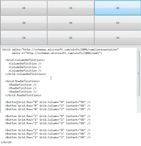 Grid in WPF
You could see multiple things in the image above. The use of attached forperties in Button.
The Rows and columns are specified and the rows and columns are sized equally as we not specified any specific size which could be done by specifying the values.
We could also specify the specific height or width of a button and the grid row or columns will be resized accordingly if the space is available for the grid to incorporate the individual requirements for the controls.
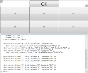 Grid in WPF
We could also set the margin properties and see the effect of these properties within the grid.
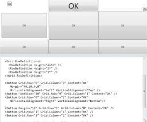 Grid in WPF
You could see the star (*) values used for the height which is relative sizing use. We can have multiple elements in a grid and also elements can span multiple rows or columns. Grid is the default layout element when you create a new vs project.
GridSplitter
You can add a grid splitter to a cell and set the direction and it will resize the columns and rows when dragged.
DockPanel, StackPanel and WrapPanel
WPF also provides DockPanel, WrapPAnel and StcakPanel as a simpler layout panels to work with. There property values are shown in the image below:
A StackPanel provides horizontal or vertical stacking of elements whereas a dockpanel provides the alignment as Top, Bottom, Left, Fill and Right and a WrapPanel provides the stacking of elements from left to right and then to new line when the line space is finished.
Canvas
Canvas is the simplest panels. It just places the elements where to tell it to i.e. absolute positioning and will cause the elements to Size to Content. The positions are specified using the Canvas attached properties Top and Right. It can be used at places where you have something like drawing a which you do not want to resize.
ScrollViewer
Another layout control is ScrollViewer. It is not a Panel. It is a Content Control which allows putting control that won’t fit the screen. The Scroll Viewer performs an unconstraint layout and tells the control that it has as much space as it asked for. But this not the actual space, it is the virtual space and the scroll viewer performs the clip and translate transform to show the view of the content. The child does not need to know that it is being scrolled. It is sometimes useful use the scrolls. If you do not want to load the full virtual space initially as it might not be as Performatic. So if you want the control to participate in the scrolling process then if the child element inside the ScrollViewer implements IScrollInfo then the scrollviewer will stop pretending that virtual space is unlimited and will give the control to element for controlling the scrolling.
ViewBox
Like scrollviewer viewbox provides solution fit in content inside a constrained space. But unlike scrollviewer ViewBox scales the content to fit the ViewBox. ViewBox does this for any kind of content like vector graphics, bitmaps or WPF controls.
As you could see in the image below, the Canvas has fixed Width and Height. The reason is that the ViewBox needs to know whats the size of the content so that it can scale and resize it accordingly.
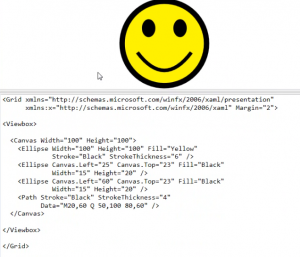 ViewBox in WPF
This works till do not set a stretch property on the ViewBox as it will start adding other behaviors in the ViewBox.
Windows
Window is the main compoanent of any WPF application. It is a Content Control. You can multiple styles in the Window like chrome, borderless or transparent.
There is also the Popup class that is used in Menus, DropDowns and ComboBox. It is also a content Control and can be put custom use.
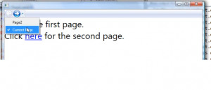
The third type of Window is Navigation Window and it is slightly different form other windows. The model is quite similar to a web browser i.e. it can be used for navigation from one Page to another as it is built using the Page Class. It has back and forward buttons for navigation. If the Navigation application does not have a Window then the WPF will create the host window and host the page there and provide the navigation controls.
 Windows in WPF
A frame in WPF is a control that will host the pages and provide the nested navigation area.
The code for this post can be downloaded here Any questions, feedback and comments are most welcome.