Silverlight 4 : Data Binding, Data Context, Data Template, Grouping, Binding to Collections
Microsoft has been offering data binding for all its user interface applications but it was an assumption that all the data binding that will happen will always be related to database. However WPF and Silverlight have a broader view assuming that the client side code is often not connected directly to the database. And Silverlight goes a step further by not providing the ADO.NET classes to connect to the database directly. This makes sense because Silverlight is used to design web pages and most organizations do not want to put their database onto the internet for obvious security reasons. So the way data comes into a Silverlight application is in the form of objects or xml. So the data biding framework in Silverlight focuses on objects. So the purpose of data binding is to connect the features of UI to the properties of the objects. Databinding can be used with nearly any property of any element.
Binding Expressions
To bind the property of a user interface element we use the binding markup extension. As you can see in below markup extensions are specified in the curly braces which are evaluated at runtime.
So this markup binding extension binds the path property of the TextBox to property named Surname and the value of this TextBox text property is evaluated at runtime. Data binding will always connects 2 properties: the target property (generally the user interface property) and the source property (a dependency
Data Context
Now as we saw in the last section that we need to provide the data binding along with the source and target property. So if want to bind multiple targets then we do not need to write the source individually for each of the target property as multiple targets can use the same source for data binding. Let’s have a look at this with an example.
Let’s create a Person class in you user interface with the following Fields as shown below.
namespace DataBindingInSL
{
public class Person
{
public string GivenName { get; set; }
public string Surname { get; set; }
public double Age { get; set; }
}
}
Now we want to bind these properties in the User Interface. So lets add the following code in the code behind file of the view.
namespace DataBindingInSL
{
public partial class MainPage : UserControl
{
Person src = new Person { GivenName = “Max”, Surname = “Smith”, Age = 34 };
public MainPage()
{
InitializeComponent();
this.DataContext = src;
}
}
}
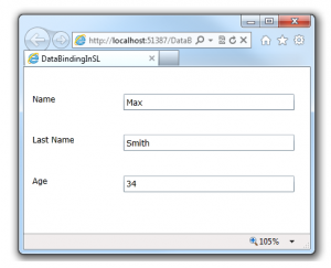
Now we are setting the DataContext of the User Interface as src. By setting the DataContext property at the root element we have made the properties available at the all the elements in the tree as the DataContext in Silverlight cascades down the tree. We could also set the datacontext on any panel as well and in that case the datacontext will apply only to the panel and its children. Once we have set this DataContext, it becomes the implicit source for all the user Interface elements. So in the View all we need to do is the property name in the binding path and the element will pick up the property from the source i.e. Data Context. Add the following code to the xaml of you SL app.
When you run the application you would see that all the TextBox will display the values that are picked up from the bindings.
 Data Context Silverlight 4
Right now the data is flowing in only one direction i.e. from src to the User Interface. If we want the data to flow in both the directions then we need to specify the mode as TwoWay in the Binding as shown below:
Text=“{Binding Path=Age, Mode=TwoWay}”
Binding Updates
As we saw in the last section that the User interface is updated with the values that are set in source at load time but when the values are updated at a later point in time then also the data binding model of Silverlight can reflect the in the source to the user interface when the data source raises change notification. The change notification can be raised after implementing the INotifyPropertyChanged.
So let’s implement the INotifyPropertyChanged interface in the data source so that whenever the source changes the User Interface is updated along with it as well. This interface has only one event which is raised whenever a property changes in the class. So change the code of the Person class as below along with the implementation of INotifyPropertyChanged.
public class Person : INotifyPropertyChanged
{
public string GivenName { get; set; }
public string Surname { get; set; }
private double _age;
public double Age
{
get { return _age; }
set
{
if (value != _age)
{
_age = value;
OnPropertyChanged(“Age”);
}
}
}
public event PropertyChangedEventHandler PropertyChanged;
private void OnPropertyChanged(string propertyName)
{
if (PropertyChanged != null)
{
PropertyChanged(this, new PropertyChangedEventArgs(propertyName));
}
}
}
Here after the implementation of INotifyPropetyChanged we change the code inside the set method of the Age property to call the OnPropertyChanged method which in turn raises the property changed event. So now when the Age property is changed the change will reflect in the User Interface as well. Change the code of the cs and xaml file to as shown below and you will be able to see the update in the property.
 Silverlight 4 Binding Updates
Data Template
We have seen the example of an adhoc binding in the previous section but Silverlight has a more structured way of defining the same using Data Template. A Data Template is similar to a Control Template. Just as the control Template determines how the Control should like, in a similar way a Data Template determines how the particular data would look like. Data Templates can be used by ItemsControls (ListBox, etc) and ContentControl (Buttons, etc). A Data Template will work at any place where a Content Model is in place.
Whenever there are custom properties in a class then it’s a good idea to define a Data Template in xaml so that the control knows how to display those types. Let’s see this working in code.
Binding to Collections
Instead of binding to one instance we can bind a control to a collection. Let’s modify the MainPage as below to create a collection of Person.
public partial class MainPage : UserControl
{
Person src = new Person { GivenName = “Max”, Surname = “Smith”, Age = 34 };
List people = new List();
public MainPage()
{
InitializeComponent();
people.Add(src);
people.Add(new Person { GivenName = “Steve”, Surname=“Gaylon”, Age=44};
people.Add(new Person { GivenName = “John”, Surname=“Miller”, Age=14};
this.DataContext = people;
}
private void button1_Click(object sender, RoutedEventArgs e)
{
src.Age += 1;
}
}
Let’s change the xaml as below:
Collection Updates
The INotifyPropertyChange will work only when a property is changed but when a collection is changed we need to implement the INotifyColectionChanged. We can either use ObservalbeCollection or implement this interface to get the update whenever a new item is added to the collection.
Let’s add a new button along with a new event handler to add a new item to the collection so we need to change the xaml and cs file to as below:
private void button2_Click(object sender, RoutedEventArgs e)
{
people.Add(new Person { GivenName = “Scott”, Surname = “D”, Age = 62 });
}
Now replace the List with ObservableCollection.
ObservableCollection people = new ObservableCollection();
And that is it. Now whenever you click the Add Item button a new item will be added to the collection and also the ListBox will be updated.
Grouping
If we want to group the data based on some criteria then we can use the CollectionViewSource. This groups the items based on the property specified of the items.
DataGrid internally understands grouping but the ItemsControl does not. So this is an advantage as by using the ItemsControl we can have our own custom visualizations.
 Silverlight 4 Grouping
When we wrap a collection in a collection view source, it provides a property known as groups. Normally we can bind to a wrapper but we can bind to the groups property instead.
Silverlight 4 Grouping
Hierarchical Binding
The basic ability to bind with hierarchical controls is provided by the HeadedItemsControl class. HeadedItemsControl derive from ItemsControl so the binding works in nearly the same way. The difference is in the ItemTemplate property as need to refer to HieraricalDataTemplate instead of a normal DataTemplate. The Hierarchical Data Template has one feature. It too has a ItemsSource Property.
Silverlight 4 Hierarchical Binding
Find the source code ralated to this post here.
Any questions, comments and feedback are most welcome.